TL;DR: To get a clean Instagram feed, stick to one preset family that matches the lighting you usually shoot in. Always adjust the brightness and colors manually for each photo after applying the preset. Finally, use planning apps like Later or Planoly to mix up your shots before posting.
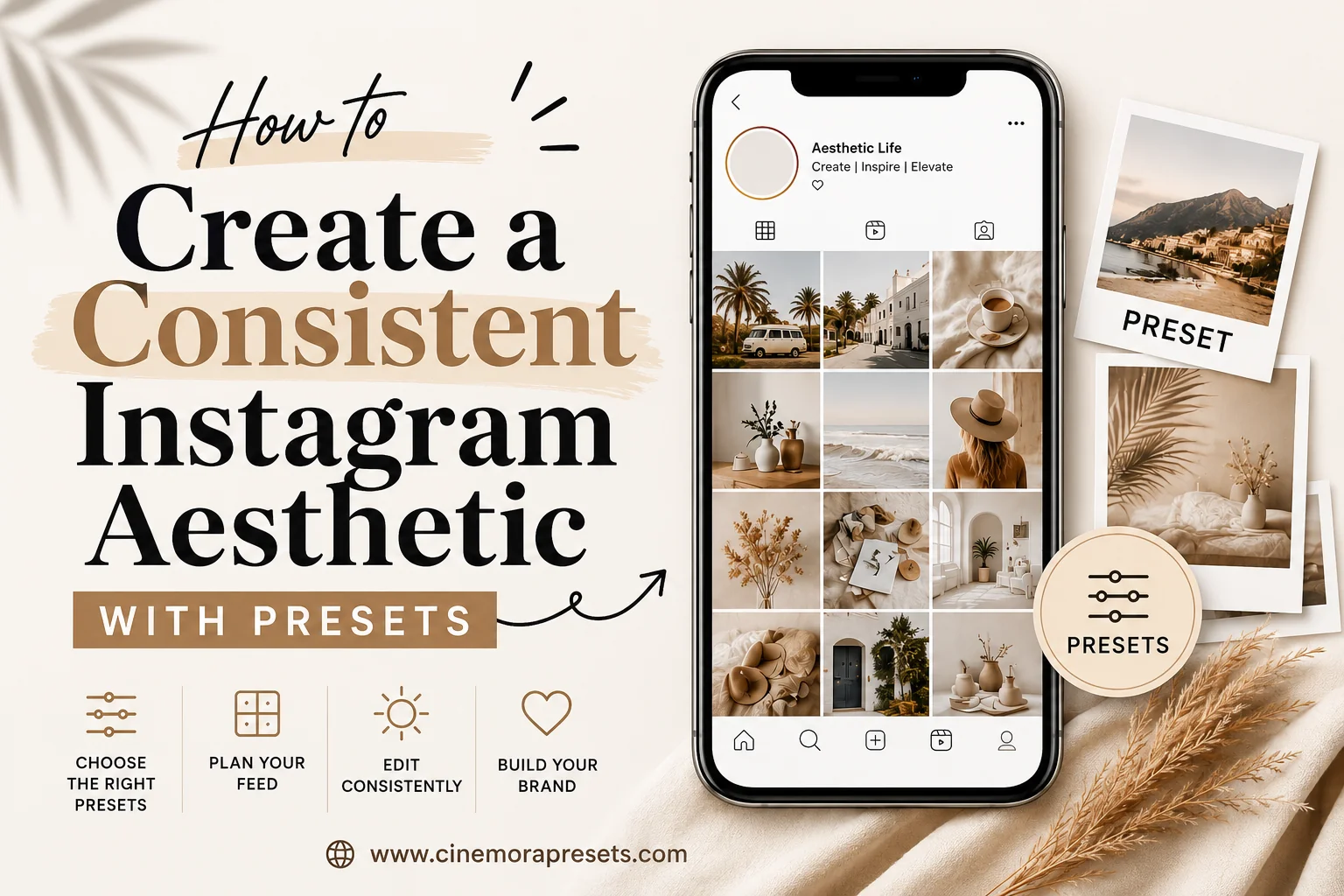
What is an Instagram Aesthetic?
An Instagram aesthetic refers to the deliberate, cohesive visual style—defined by consistent color palettes, tone curves, and light temperatures—that unifies an entire profile grid. Rather than treating each post as an isolated image, a successful aesthetic treats the grid as a single canvas where every photo complements the next.
When I first started posting, I made the classic rookie mistake: I edited every photo based on my mood that day. One post was a warm golden portrait, the next was a cool desaturated street scene, and the third had heavy contrast. My grid looked like a chaotic moodboard rather than a professional portfolio. The moment I committed to a single color signature and structured my layout, my follower-to-visitor conversion rate tripled.
Consistency does not mean making every photo look identical. It means ensuring they all feel like they were captured in the same world under similar light.
Why does feed consistency matter for creators?
In 2026, the Instagram grid remains the ultimate digital resume for creators, influencers, and brands. According to a feed layout study by Later, new visitors make follow or unfollow decisions within approximately 2.5 seconds of landing on a profile. If your grid looks messy, visitors leave—even if your individual photos are stunning.
A cohesive feed establishes instant brand authority and makes your content recognizable in the Home feed or Explore tab. When someone scrolls past your photo, they should know it is yours before reading the username. For creators seeking brand partnerships, a unified aesthetic demonstrates creative maturity and reliable asset production, signals that agencies prioritize when commissioning sponsored posts.
Building a consistent feed does not require expensive lenses or complex studio setups. It simply requires a clear visual plan and the discipline to stick to it.
How do you build a cohesive Instagram aesthetic?
Step 1: Align Your Preset with Your Primary Light Source
The most common reason presets look mismatched is that creators apply them to photos shot in completely different lighting conditions. A preset designed for bright, direct sunlight will look muddy when applied to an underexposed indoor photo.
Before choosing an editing style, evaluate where and when you shoot most of your content:
- Golden hour and outdoor lifestyle: Opt for warm, glowy presets like the Aesthetic Lightroom Presets or Golden Hour Presets.
- Indoor fashion and minimalist interiors: Choose clean, neutral tones such as the Beige Aesthetic Lightroom Presets or Minimal Lightroom Presets.
- Overcast travel and raw landscapes: Lean into organic green and faded film styles like the Film Presets or Forest Presets.
- Dark editorial or moody portraits: Choose deep, shadow-heavy curves like the Moody Lightroom Presets.
If you primarily shoot in dark gyms or at night, do not choose a "bright and airy" style. The preset will force exposure values that introduce heavy digital noise and wash out your native contrast.
Step 2: Stick to a Single Preset Family
A preset family is a collection of 3 to 8 presets that share the same color science—identical hue shifts and tone curves—but are individually calibrated for different light sources (e.g., indoor, shadow, sun, backlight).
Using presets from the same family ensures that your colors look identical across all posts. If your outdoor photo uses "Aesthetic-Sun" and your indoor selfie uses "Aesthetic-Indoor", the white points and skin tones will match perfectly. If you mix presets from different creators on the same feed, the contrasting color grading will split your grid apart.
Step 3: Tweak the "Big Three" Post-Preset Settings
Presets are never "one-click fixes." Every photo is shot with different camera sensors, white balances, and exposure levels. To keep your feed unified, import your photo, apply your preset, and immediately adjust the following three settings:
- Exposure: Bring the overall brightness up or down to match the average light level of your feed.
- Temp / Tint (White Balance): This is critical. If one photo is too yellow and the next is too blue, your grid will look disorganized. Match the whites in your image to the white tones in your previous posts.
- Orange Saturation / Luminance: Go to the HSL/Color panel, select Orange, and adjust the sliders to keep your skin tones looking natural and consistent.
If you struggle to get your photos to match even after applying these tweaks, check out our guide on why presets look different on every photo for a deep dive into camera calibration issues.
Step 4: Plan Your Grid Composition
A consistent aesthetic is as much about composition as it is about editing. If you post three close-up portraits in a row, your feed will look cluttered and repetitive.
Use grid preview tools like Planoly, Later, or UNUM to arrange your next 6 to 9 posts. When planning your layout, apply these compositional balance rules:
- The Checkerboard Layout: Alternate between busy lifestyle photos and clean, minimalist detail shots or flat lays.
- The Diagonal Balance: Keep similar colors, outfits, or backdrops aligned diagonally across the grid rows.
- Visual Breathing Room: Ensure you surround heavy, detailed photos with simple, high-negative-space images so the eye can navigate your feed easily.
Comparison: Instagram Preset Styles & Core Tones
| Preset Style | Dominant Color Palette | Best Suited For | Feed Mood | Recommended Pack |
|---|---|---|---|---|
| Beige & Warm | Cream, tan, olive, soft white | Neutral fashion, interiors, cafes | Luxurious, warm, editorial | Beige Presets |
| Aesthetic | True whites, warm skin, vibrant tones | Travel, everyday lifestyle, beauty | Clean, polished, bright | Aesthetic Presets |
| Moody | Deep teal, charcoal, desaturated green | Portraiture, street, concerts | Dramatic, emotional, cinematic | Moody Presets |
| Vintage Film | Faded green, warm highlight, soft grain | Travel blogging, casual lifestyle | Nostalgic, authentic, retro | Film Presets |
| Minimal | Cool gray, white, muted black | Architecture, tech, urban | Spacious, modern, clean | Minimal Presets |
Common Mistakes That Ruin Feed Cohesion
Switching Styles Too Fast
The number one feed-consistency killer is style hopping. You see a moody photo, apply a moody filter, get bored, and switch to a bright pastel look three days later. Your grid needs at least 15 to 18 consistent posts before the visual theme becomes recognizable. Commit to one preset family for at least a month before deciding to transition.
Forcing a Photo that Doesn't Fit
Some photos simply do not belong in your feed. If a photo was taken under harsh neon lights at a restaurant, it will not match a natural-light beach feed no matter how much you edit it. Be willing to share those mismatched photos on your Instagram Stories instead of breaking your grid's visual flow.
Frequently Asked Questions
How many presets should I use for a consistent Instagram feed?
Stick to 1 to 3 presets from the same preset family. Using variations of the same style ensures your colors, contrast, and highlights remain unified across different lighting situations, from bright outdoor sun to dark indoor rooms.
Do I need to shoot in RAW to get a cohesive feed?
Yes, shooting in RAW is highly recommended. RAW files preserve all image data, allowing you to match white balance and shadow details across different photos. JPEG files bake in camera processing, limiting your editing range. Read our JPEG vs RAW guide to learn more.
How do I change my Instagram aesthetic without losing engagement?
Shift your aesthetic gradually over 6 to 9 posts. Slowly blend in elements of your new style—like lowering contrast or warming up shadows—so your transition happens smoothly across the grid rather than creating a jarring break that confuses followers.
What is the best aspect ratio for Instagram grid photos?
Use the 4:5 vertical crop (1080 x 1350 pixels) for all feed posts. This format takes up the maximum screen real estate in the home feed, leading to higher engagement and a more immersive viewer experience compared to square or landscape crops.
How do I keep skin tones consistent when using presets?
Adjust the Orange slider in Lightroom's HSL panel. Lower orange saturation slightly to remove artificial tans, and increase orange luminance to brighten skin tones. If your presets cause discoloration, read our orange skin tones guide to fix it.
Conclusion
Creating a consistent Instagram aesthetic with presets is a matter of discipline, not complex editing tricks. Choose a color palette that matches your life, select a single preset family that handles your primary light source, tweak the exposure and white balance for every shot, and preview your grid layout before hitting publish.
If you are ready to start building your look, download the Aesthetic Lightroom Presets or Beige Aesthetic Presets for free. These packs offer the most versatile and forgiving color science for beginners. Stay consistent, plan ahead, and let your feed do the talking!