TL;DR: Presets are starting points, not final edits. Exposure, white balance, and ISO all affect how a preset lands on your specific photo. A 2-minute tweak to exposure and HSL fixes 90% of cases.
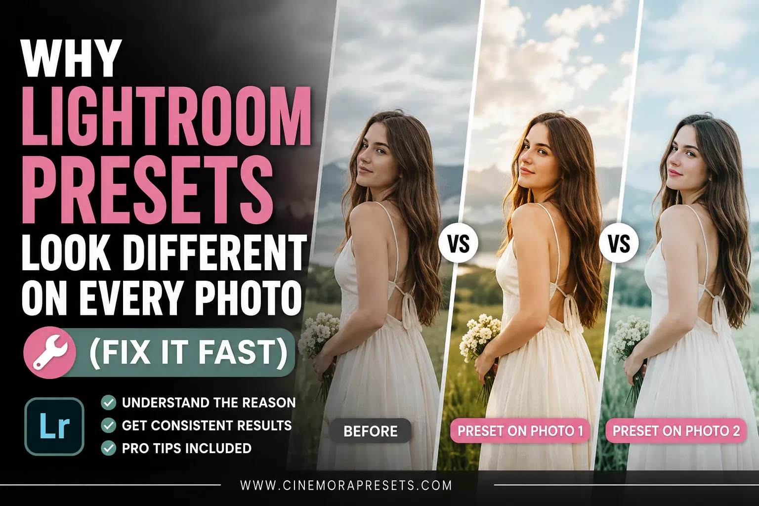
I downloaded a pastel preset last year that looked incredible on the creator's beach photos. Soft pink tones, clean skin, bright highlights. Perfect.
Then I applied it to my own photos and got a muddy, greenish mess.
Same preset. Completely different result.
That was the moment I actually understood how Lightroom presets work — and why almost everyone runs into this exact problem. Here is the full breakdown.
The core reason: a preset has no idea what is in your photo
A Lightroom preset is just a saved list of slider values. When you apply it, Lightroom adds those values on top of whatever your photo already has.
So if the preset sets Exposure to +0.30, and your photo was already slightly overexposed, you end up at +0.80 effectively. If the preset pulls Highlights to -40, but your photo has very few highlights to begin with, the image just gets darker and flat.
The preset creator shot their photos in specific lighting conditions, with a specific camera, at a specific white balance. Their preset was tuned for that. Your photo is different. That is the whole story. Not sure what settings your photo was shot with? Use our Image Metadata Viewer to check the exact exposure, ISO, and white balance before applying any preset.
The 5 most common reasons a preset looks wrong
1. Your exposure does not match
This is responsible for maybe 60% of bad preset results. If the preset was built for a well-lit outdoor shot and you are applying it to a dim indoor photo, the shadows will block up and everything will look muddy.
🔧 The Fix: After applying the preset, adjust the Exposure slider first. Move it until the photo feels correctly lit before touching anything else. On pastel presets like ours, you are usually aiming for a bright, airy feel — so do not be afraid to push Exposure up by +0.30 to +0.50 on darker shots.
2. White balance is fighting the preset
Presets often include a specific Temp and Tint value because color grading depends on a neutral base. If your photo was shot in tungsten light (very orange) and the preset assumes daylight, the colors will look muddy or oversaturated.
🔧 The Fix: Go to the White Balance sliders and pull Temperature toward a cooler, more neutral tone before judging the preset. For pastel looks, a Temp somewhere between 5000K and 5800K usually gives the cleanest result.
3. Your ISO was high
High ISO photos have grain and noise that presets interact with badly. Lifting shadows on a noisy file — which pastel and airy presets do — makes that grain very obvious. The photo ends up looking textured and harsh instead of soft and clean.
🔧 The Fix: Add a small amount of Noise Reduction before applying the preset. Even Luminance Noise Reduction at 20-30 is enough to smooth things out. Apply the preset after, not before.
4. The subject's skin tone is different from the preview photo
Pastel presets in particular are often built and previewed on lighter skin tones. If you apply the same preset to a photo with deeper skin tones, the orange-heavy HSL adjustments can shift skin to an unnatural color.
🔧 The Fix: Open the HSL / Color Mixer panel after applying the preset. Select the Orange channel. Lower Saturation by -10 to -20 and bump Luminance up by +10. This alone fixes orange skin tones in most cases without affecting the rest of the photo.
5. You are applying it to a JPEG instead of a RAW file
JPEG files have already had their colors processed and compressed by the camera. They have less dynamic range, less shadow detail, and less room to push edits. Presets built for RAW files will often look too harsh, too saturated, or too washed out on JPEGs.
🔧 The Fix: If you are shooting JPEG and cannot switch to RAW, dial back the preset intensity. Specifically, reduce the Clarity, Dehaze, and Saturation adjustments that come with the preset. On moody or film presets this makes a huge difference.
The exact 3-step fix that works on 90% of photos
After applying any preset, do these three things before deciding whether you like it:
Step 1 — Fix exposure first. Adjust the Exposure slider until the brightness feels right for the mood you want. Do not touch anything else yet.
Step 2 — Check white balance. If the colors look too warm or too green, pull the Temperature slightly cooler. Most presets are designed for daylight conditions around 5200K to 6000K.
Step 3 — Tweak the HSL panel. If skin tones look off, go to Orange in the Color Mixer. If the sky looks wrong, go to Blue or Aqua. Small -10 to +10 adjustments here fix almost every color problem that survives steps 1 and 2.
That is it. Most people skip these three steps and conclude the preset is bad. In almost every case, the preset just needs these small adjustments for your specific photo.
Pastel vs moody presets: which is harder to make consistent?
This comes up a lot and the honest answer is pastel presets require more per-photo adjustment than moody presets.
Moody presets crush the blacks and boost contrast, which hides a lot of variation between photos. Pastel presets lift the shadows and soften highlights, which means any exposure or color inconsistency in the original photo becomes more visible.
| Issue | Pastel presets | Moody presets |
|---|---|---|
| Exposure sensitivity | High — bright photos look great, dark ones suffer | Low — dark tones get hidden by contrast |
| Skin tone issues | Common — orange shifts visible | Rare — contrast masks most tone issues |
| White balance sensitivity | High — warm shots can go muddy | Medium — dark tones absorb some WB shifts |
| Noise visibility | High — shadow lifting reveals grain | Low — blacks hide grain |
| Time to adjust per photo | 2-4 minutes | 1-2 minutes |
If you want a one-click style that needs almost no adjustment, moody or cinematic presets are more forgiving. If you want clean, airy, soft photos, pastel presets give better results but they need that quick 3-step fix on each photo.
One thing most preset tutorials never tell you
The preview photo on a preset page is almost always the best possible version of that preset. Preset creators (including us) pick photos that already match the preset's ideal conditions. Clean light, good exposure, neutral white balance. That is not deception — it is just showing the preset at its best.
Your photos will not always start at that same baseline. But that does not mean the preset is wrong for your photos. It just means you need that 2-minute adjustment step to get there.
Once you do that adjustment a few times, it becomes automatic. You stop thinking of presets as one-click solutions and start using them as starting points — which is what they actually are.
Which Cinemora Presets need the least adjustment?
Based on download feedback and our own testing:
- Pastel Lightroom Presets — needs exposure and HSL check on most photos, but skin tones come out very clean after adjustment
- Moody Lightroom Presets — lowest adjustment needed, very forgiving on different lighting conditions
- Film Lightroom Presets — medium adjustment needed, especially white balance on indoor shots
- Portrait Lightroom Presets — built specifically for skin tones, usually needs only an exposure tweak
- Cinematic Lightroom Presets — needs white balance check, especially on shots with mixed lighting
If you are brand new to presets, start with the moody or portrait options. Once you are comfortable with the 3-step fix, the pastel and film presets will feel a lot more manageable.
FAQ
Why does the same preset look completely different on two photos shot on the same day?
Even photos from the same shoot can vary by 1-2 stops of exposure depending on whether you were in shade or direct sun. That difference alone changes how the preset lands. Shoot in consistent light or plan to do the 3-step adjustment on each batch.
Do presets work differently on Lightroom Mobile vs Desktop?
The XMP preset file is the same and the slider values are identical. The difference you sometimes see is that Lightroom Mobile uses the phone camera's default RAW processing, which handles highlights and shadows slightly differently than desktop. If a preset looks great on desktop but harsh on mobile, reduce Highlights by -10 to -20 on the mobile version.
Can I save my adjusted preset as a new preset?
Yes. After making your adjustments, go to the Presets panel, click the plus icon, and save as a new preset with a name like "Pastel — Indoor" or "Pastel — Golden Hour." Over time you will build a small personal library of variations that work perfectly for your specific shooting conditions.
What if nothing I do makes the preset look good?
Some photos are genuinely not a match for certain styles. A photo shot at ISO 3200 in a dark bar is not going to look great with a pastel preset no matter what you do. The style depends on bright, clean originals. In that case, try a different preset family — film or moody presets handle dark and high-ISO photos much better.