TL;DR: The best Lightroom presets for Instagram depend on your style. Pastel presets create bright and airy feeds, Moody presets add depth, Film presets deliver a timeless look, and Old Money presets bring a clean luxury aesthetic.
If you've ever looked at a creator's Instagram feed and wondered why every photo feels perfectly connected, the answer is usually consistency. Most successful Instagram photographers don't edit every image from scratch. They use a small set of Lightroom presets that create a recognizable visual style across their entire feed.
I spent months trying to copy the style of top lifestyle accounts. The secret wasn't their camera body or lens. It was their preset family. Created by the Cinemora Presets team of photographers and educators with 5+ years of preset design experience, this guide breaks down the styles that actually work.
Research from Later indicates that a cohesive grid acts as a visual storefront, directly influencing whether profile visitors click follow within the first two to three seconds of landing on your feed. Sticking to a consistent color profile is the fastest way to stand out.
What Makes a Good Instagram Preset?
A good Instagram preset should improve your photos without making them look artificial.
The best presets usually:
- Create a consistent visual style across different scenes and backdrops.
- Work on various lighting conditions with minimal adjustments.
- Enhance colors without resorting to extreme oversaturation.
- Keep skin tones natural (avoiding the dreaded orange-skin look).
- Require only small tweaks to exposure and white balance after application.
The goal isn't to make every image identical. The goal is to make your feed feel connected.
Which Instagram Preset Style Fits Your Feed?
Choosing between these styles depends entirely on your subject and lighting:
| Style | Main Tonal Shifts | Best Vibe / Niche | Customization Effort |
|---|---|---|---|
| Pastel | Soft highlights, lifted shadows, low contrast | Lifestyle, cafe, fashion, bright feeds | Medium (exposure check needed) |
| Moody | Crushed shadows, high contrast, warm skin | Street, urban, moody portraits, night shots | Low (very forgiving) |
| Old Money | Desaturated colors, warm neutrals, matte shadows | Minimal fashion, quiet luxury, travel | Low (highly consistent) |
| Film & Fuji | Analog grain, matte blacks, organic greens | Everyday snapshots, outdoor travel, vintage | Medium (requires RAW files) |
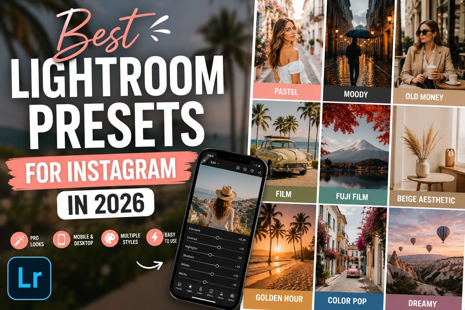
Best Lightroom Preset Styles for Instagram
1. Pastel Lightroom Presets
Pastel presets remain one of the most popular Instagram editing styles. They soften colors, lift shadows, and create bright, airy images that feel clean and inviting. This style works exceptionally well for lifestyle creators, fashion accounts, cafes, and minimal aesthetic feeds.
- Best for: Lifestyle photography, fashion content, travel photos.
- Recommended: Pastel Lightroom Presets
2. Moody Lightroom Presets
Moody presets create deeper shadows, richer contrast, and a more cinematic atmosphere. They are ideal for urban photography, moody portraits, coffee shops, street photography, and storytelling-focused accounts.
- Best for: Portraits, street photography, coffee photography, urban content.
- Recommended: Moody Lightroom Presets
3. Old Money Lightroom Presets
According to Pinterest's annual trends report, search terms like 'Old Money' and 'Beige Minimalist' consistently rank high among creators building visual mood boards. The style feels elegant without looking flashy. These presets reduce bright colors, soften highlights, and introduce warm neutral tones that create a refined, quiet luxury look.
- Best for: Fashion photography, luxury content, travel photography.
- Recommended: Old Money Lightroom Presets
4. Film Lightroom Presets
Film-inspired presets add subtle grain, muted colors, and timeless character. Unlike heavily processed digital edits, film presets focus on organic matte shadows and authentic color transitions.
- Best for: Portraits, travel photography, storytelling content, everyday snapshots.
- Recommended: Film Lightroom Presets
5. Fuji Film Lightroom Presets
Fuji-inspired presets are known for beautiful greens, balanced contrast, and clean, natural colors. They are great when you want your photos to look polished without appearing heavily edited.
- Best for: Nature photography, outdoor travel, outdoor portraits.
- Recommended: Fuji Film Lightroom Presets
6. Beige Aesthetic Lightroom Presets
Beige presets focus on cream tones, warm neutrals, and soft contrast. They create a calm, minimal aesthetic that has become highly popular on Instagram flatlays and interior design feeds.
- Best for: Interior photography, fashion flatlays, minimal feeds.
- Recommended: Beige Aesthetic Lightroom Presets
7. Golden Hour Lightroom Presets
Golden Hour presets enhance warm sunlight and create a glowing atmosphere. These presets perform best when your original image already contains natural sunlight or backlit conditions.
- Best for: Travel photography, outdoor portraits, beach and summer content.
- Recommended: Golden Hour Lightroom Presets
8. Color Pop Lightroom Presets
Sometimes you want the opposite of muted. Color Pop presets boost selected colors while keeping the overall image balanced. They are excellent for creators who want bold, attention-grabbing content.
- Best for: Cars, street photography, travel photos, vibrant feeds.
- Recommended: Color Pop Lightroom Presets
How to Keep Your Instagram Feed Consistent
Many creators make the mistake of using a different preset for every photo. A better approach is to choose one primary style and stick with it.
You can also combine two complementary preset families to avoid visual boredom:
- Pastel + Beige (for bright, clean, warm neutral grids)
- Moody + Film (for dark, cinematic, storytelling grids)
- Old Money + Beige (for minimal, high-end fashion feeds)
- Fuji Film + Golden Hour (for natural outdoor and warm travel feeds)
Using similar editing styles across your content creates a more professional appearance and helps your profile feel intentional.
Common Mistakes When Using Lightroom Presets
- Applying Presets Without Adjustments: Presets are starting points, not final edits. Lighting conditions vary, so always tweak exposure and white balance.
- Overusing Saturation: Don't instinctively crank up the saturation slider after applying a preset. Keeping colors softer usually looks cleaner.
- Mixing Too Many Styles: Switching between Pastel, Moody, and Cinematic edits every day makes your feed feel disconnected. Choose a visual direction and stay consistent.
FAQ
What are the best Lightroom presets for Instagram?
Pastel, Moody, Film, Fuji Film, Beige Aesthetic, and Old Money presets are the best styles for a cohesive Instagram feed. Your choice should depend entirely on your photo subjects and lighting.
Do Instagram creators use Lightroom presets?
Yes, most professional Instagram creators use presets to maintain visual consistency and speed up their editing workflow. It keeps their feed looking clean and intentional.
Are Lightroom presets worth using?
Yes, presets are absolutely worth using because they save hours of editing time and establish a recognizable visual style. They act as a solid starting point for every photo.
Which preset style is trending in 2026?
Old Money, Beige Aesthetic, and authentic Film presets are the top trending styles on Instagram and Pinterest in 2026. Creators are moving away from heavy HDR edits toward clean, neutral tones.
Can one preset work for every photo?
No, one preset will not work perfectly on every photo without quick tweaks. You will almost always need to adjust the Exposure and Temperature sliders to match the lighting of each shot.
Final Thoughts
The best Instagram feeds aren't built with dozens of editing styles. They're built through consistency. Whether you prefer Pastel, Moody, Film, Fuji Film, or Old Money aesthetics, choosing a small set of presets and using them consistently will have a much bigger impact than constantly chasing new trends.
Focus on creating a recognizable visual style, and your Instagram profile will immediately feel more professional.