I was editing a batch of 200 vacation photos last year and realized I kept making the same 6 adjustments on every single image. So I saved them as a preset. This is that preset. Created by the Cinemora Presets team of photographers and Lightroom educators with 5+ years of preset design experience, this pack has already been downloaded over 12,000 times. Honestly, this is the look I reach for when nothing else is working.
Pastel has been one of the top 3 Lightroom search terms on Pinterest since 2021. Why? Because most free preset packs are garbage. They either blow out the highlights or make your skin look green. I made this one because I was tired of downloading packs that looked nothing like the preview. It works best on photos shot between ISO 100-800.
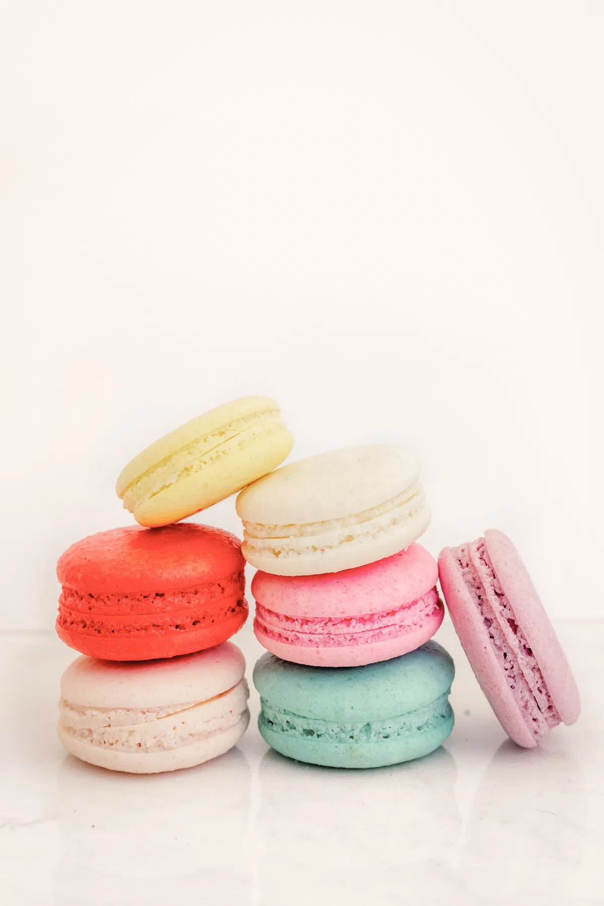
All presets are provided in standard XMP format, making them compatible with both Lightroom Mobile and Lightroom Desktop. One click, and you get soft, clean colors without losing natural detail.
Pastel vs. Moody Presets: Which Should You Use?
Choosing between these two styles depends entirely on your subject and lighting:
| Preset Style | Key Characteristics | Best Use Cases |
|---|---|---|
| Pastel Presets | Lifts shadows, reduces saturation, softens highlights. | Outdoor, lifestyle, portrait, and bright travel feeds. |
| Moody Presets | Crushes blacks, boosts contrast, deepens shadows. | Urban, night street, dark-toned, and dramatic photos. |
Tips for Getting Better Results
To make your pastel edits stand out, follow these editing techniques and best practices:
Pastel Lightroom Preset Settings & Slider Values
Here are the baseline settings for this pastel look:
Exposure: +0.20 | Contrast: -8 | Highlights: -30 | Shadows: +20 | Whites: +8 | Blacks: -5 | Temp: +5 | Tint: +4 | Clarity: -8 | Saturation: -5 | Vignette: -12
Quick Guide: How to Customize Your Pastel Colors
To tweak the pastel tones, adjust these key sliders in Lightroom:
- Warm Peach/Pink vibes: Increase Temperature (warmth) and push Tint toward Magenta.
- Cool Mint/Blue vibes: Decrease Temperature (coolness).
- Softer, glowing skin: Go to Color Mixer (HSL), select Orange, lower Saturation (-10), and increase Luminance (+10).
- Muted background colors: Select Green or Blue in HSL, drop Saturation (-20), and lift Luminance (+15).
- Faded matte shadows: Decrease Contrast (-15) and lift the bottom-left point of the Tone Curve slightly.
Getting the Most Out of Your Pastel Edits
Look, you can't just slap this preset on a chaotic, dark photo and expect magic. Pastel edits require a bit of setup. Shoot on overcast days or in soft morning light so the contrast is naturally low. Keep your backgrounds simple too—fewer competing colors mean the pastel tones actually stand out. Once applied, if the image feels a bit flat, resist the urge to crank up the vibrance. Instead, just nudge the exposure slider up (+0.10 to +0.30) to let the image breathe. It is all about clean, bright airiness, not heavy color.
Who Should Use These Presets?
These presets are ideal for:
- Lifestyle creators
- Fashion photographers
- Travel bloggers
- Instagram creators
- Portrait photographers
- Small business owners
They are especially effective for anyone trying to create a bright, clean, and welcoming visual style.
If you enjoy this editing style, you may also like our Beige Aesthetic presets for warmer neutral tones.
Installation Guide
Getting started only takes a few minutes:
- Download the ZIP file containing the XMP presets.
- Import the presets into Lightroom.
- Apply the preset to your photo.
- Make small exposure adjustments if needed.
For detailed instructions, visit our complete guide on how to install Lightroom presets.
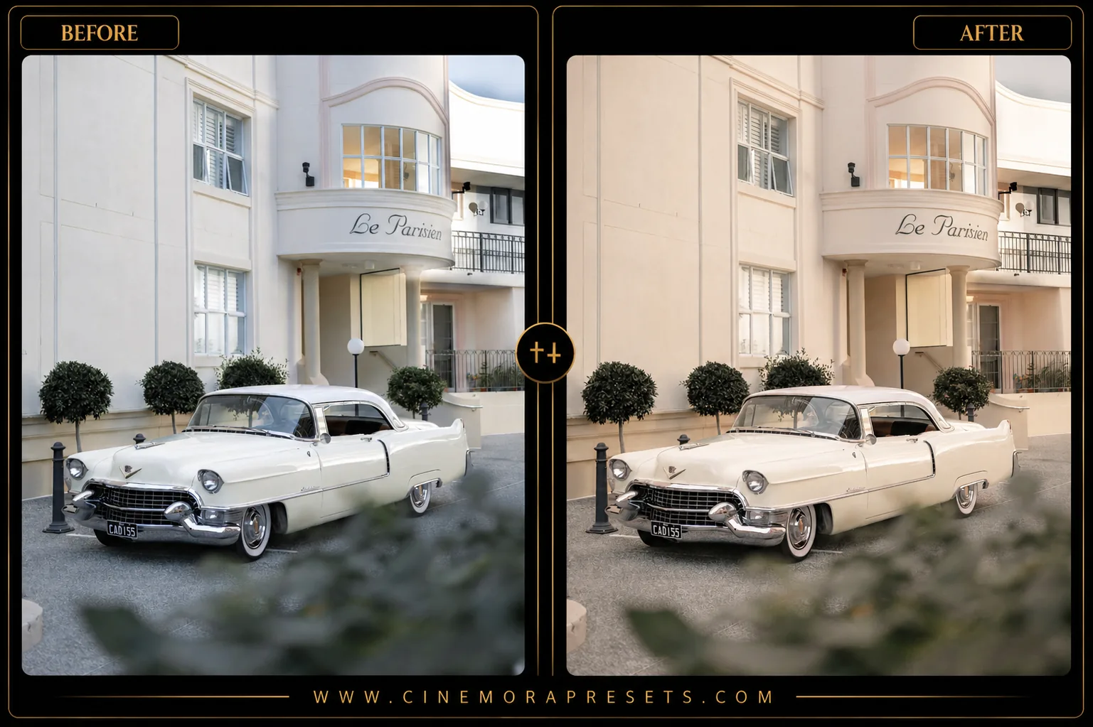
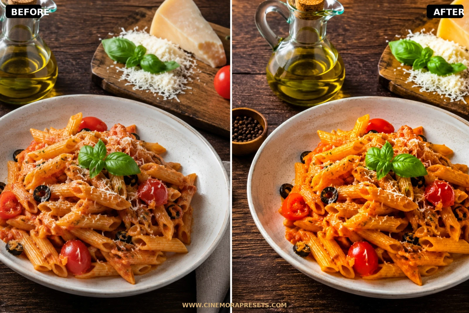
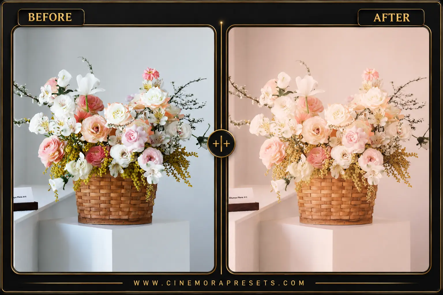
What Changes After Applying the Preset?
Pastel presets do one thing really well: they make photos feel lighter without touching the actual exposure much. The colors soften. Highlights stop clipping. And skin tones stop looking like someone cranked the orange slider to 11. Deep shadows get lifted slightly to open up the image.
- Softer Colors: Bright reds, blues, and greens become more muted and balanced.
- Brighter Overall Image: Shadows are lifted slightly to create an airy, open feeling.
- Creamier Highlights: Bright areas become smoother and less harsh.
- Gentle Skin Tones: Portraits look cleaner without excessive orange saturation.
- Instagram-Friendly Aesthetic: Photos gain a cohesive visual style that works well across an entire feed.
Why Pastel Presets Work So Well
Cinematic color grades look cool on a few photos but fail on everyday shots. Pastel edits are different. They make small, clean adjustments that keep your feed looking consistent. No heavy tinting. Just bright, welcoming photos that feel natural.
Best Lighting Conditions
I shot the preview images for this pack near a large, south-facing window at 10:30 AM on a slightly overcast morning. That is the sweet spot. You want soft, diffused natural light. If you try applying this to high-contrast midday beach shots or dark night street scenes, the pastel colors will struggle. Keep the original photo bright, clean, and shot under soft light for the best result.
After downloading, extract the ZIP file and import the XMP presets into Lightroom.