TL;DR: To create cinematic Lightroom edits, professional photographers fade the shadows and highlights using the Tone Curve, apply complementary color grading (like teal and orange) to shadows and highlights, and refine skin tones using the HSL panel. This deliberate color harmony creates a movie-like atmosphere and tells a deeper story.
What Is Cinematic Color Grading?
Cinematic color grading in photography is the process of altering and enhancing the color and light of an image to evoke a specific emotional response and establish a movie-like visual narrative. Unlike standard editing, which focuses on color accuracy, cinematic editing prioritizes mood, depth, and storytelling.
When I first transitioned from commercial photography to creative portraiture, I realized that my clean, perfectly exposed images felt flat. They lacked soul. It wasn't until I began studying cinema color palettes that I understood how films use color to guide the viewer's emotions. By applying these cinematic techniques to Lightroom, I was able to transform simple snapshots into compelling visual stories.
Why It Matters: The Power of Cinematic Edits
The goal of cinematic editing is to draw the viewer into a scene, making them feel like they are looking at a still frame from a high-budget motion picture. Here is why this style is so powerful:
- Emotional Resonance — Warm tones evoke nostalgia or intimacy, while cool tones convey loneliness, suspense, or isolation.
- Visual Depth — By styling shadows and highlights with complementary colors, you create a natural contrast that makes subjects pop.
- Stylistic Identity — Consistent cinematic grading helps establish a recognizable, premium look across your entire portfolio.
How It Works: The Cinematic Blueprint
Creating a cinematic image requires a structured approach to Lightroom's editing panels. We aren't just boosting saturation; we are carefully sculpting the tone and color hierarchy of the frame.
The Hollywood Teal & Orange Palette
If you look closely at blockbuster films, you will notice a recurring theme: teal in the shadows and orange in the midtones and highlights. This isn't random. Teal and orange are complementary colors on opposite sides of the color wheel. Because human skin tones naturally fall in the orange/warm spectrum, placing them against a cool, teal background makes the subject stand out instantly.
In Lightroom, we achieve this through the Color Grading and HSL panels, ensuring that the warm tones are preserved for the skin while the shadows are cooled down.
Tone Curve Mastery
The Tone Curve is the engine of any cinematic edit. I always start by creating a gentle "S-curve" to build contrast, but the secret cinematic touch is fading the blacks and highlights.
- Faded Blacks — Raise the leftmost point of the curve slightly. This turns pure black shadows into a soft, matte charcoal tone.
- Faded Highlights — Lower the rightmost point of the curve. This prevents harsh, blown-out whites and gives the image a soft, vintage film roll-off.
- S-Curve Contrast — Add a point in the shadows and drag it down, and a point in the highlights and drag it up. This keeps the image punchy despite the faded blacks.
Split Toning & Color Grading Panel
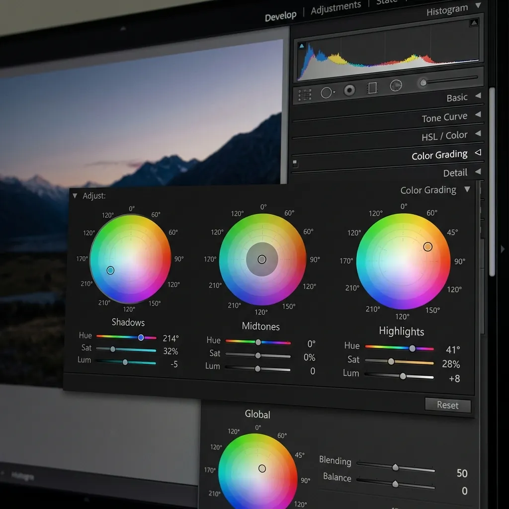
Lightroom's Color Grading panel allows you to inject specific hues into the Shadows, Midtones, and Highlights independently. For a classic cinematic grade:
- Shadows — Add a cool teal or blue hue (Hue: 200–220, Saturation: 10–15%).
- Highlights — Add a warm gold or orange hue (Hue: 35–45, Saturation: 5–10%).
- Midtones — Keep them neutral or add a subtle warm tint to preserve skin tones.
- Balance Slider — Adjust this to control whether the cool shadow tones or warm highlight tones dominate the image.
HSL Adjustments for Cinematic Skin Tones
The HSL (Hue, Saturation, Luminance) panel is where we fine-tune specific color channels. To keep skin tones looking natural amidst a cinematic grade:
- Orange Channel — Shift the Orange Hue slightly to the right to prevent skin from looking too red. Adjust Orange Luminance up to make the skin look luminous.
- Green & Yellow Channels — Desaturate greens and yellows. Bright green grass and yellow street lights can distract from the cinematic mood.
- Blue Channel — Shift the Blue Hue toward teal and slightly desaturate to complement the shadow grade.
Practical Steps: Creating the Cinematic Look
- Fix the Exposure and White Balance — Start with a clean slate. Adjust exposure and white balance to ensure details in the shadows and highlights are preserved.
- Apply the Tone Curve — Create your S-curve and raise the black point to get that soft, matte finish.
- Color Grade Shadows and Highlights — Open the Color Grading wheels and apply teal to the shadows and gold to the highlights.
- Fine-tune in HSL — Desaturate distracting greens and yellows, and adjust the orange channel to optimize skin tones.
- Add Film Grain — Open the Effects panel and add a small amount of Grain (Amount: 15–20, Size: 25, Roughness: 30) to mimic analog film stock.
Comparison of Editing Styles
| Feature | Cinematic Style | Film Style | Moody Style |
|---|---|---|---|
| Shadows | Teal-tinted, slightly faded | Warm, high-fade | Heavy, deep, slightly crushed |
| Highlights | Warm golden, soft roll-off | Creamy, yellow-tinted | Muted, dark |
| Contrast | Medium-High (punchy) | Low-Medium (soft) | High (dramatic) |
| Colors | Complementary (Teal/Orange) | Faded, organic, pastel | Desaturated, earthy |
| Grain | Fine, subtle | High, visible | Medium |
Common Mistakes to Avoid
Over-Saturating the Image
Cinematic is not the same as high saturation. In fact, most movies have a relatively desaturated, controlled palette. Keep your global saturation low and rely on color harmony rather than vibrance.
Crushing the Shadows Completely
While contrast is important, completely black, detail-free shadows look amateurish. Use the Tone Curve to fade the shadows rather than dragging the black slider all the way down.
Unnatural Skin Tones
When you grade highlights orange, skin tones can quickly become oversaturated and look fake. Always use the HSL panel to adjust orange saturation and luminance individually to keep skin tones believable. If you're struggling to get this right, follow our step-by-step guide on how to fix orange skin tones in Lightroom.
Frequently Asked Questions
What is the difference between color correction and color grading?
Color correction fixes exposure and white balance to make an image look natural. Color grading adds stylistic colors and tones to create a specific mood or artistic style.
Do professional cinematic presets work on every photo?
No preset works perfectly on every photo. You will always need to make minor adjustments to exposure and white balance to account for the unique lighting in your shot.
Why is teal and orange so popular in cinematic grading?
Teal and orange are complementary colors, meaning they create the highest visual contrast. Since skin tones are warm, cooling down the shadows makes subjects pop naturally.
How do I get faded blacks without losing image contrast?
Create an S-curve on the Tone Curve to maintain midtone contrast, then lift the absolute bottom-left point of the curve to fade the deepest shadows.
Can I achieve a cinematic look with JPEG images?
Yes, but RAW files are highly recommended. RAW files contain far more color and shadow detail, allowing you to push the color grading much further without quality degradation.
Conclusion
Creating cinematic Lightroom edits isn't about applying a magic filter; it's about understanding how light and color interact to tell a story. By mastering the Tone Curve, adopting complementary color schemes like teal and orange, and preserving natural skin tones, you can elevate your photography to a professional, filmic standard.
If you want to speed up your editing workflow, check out the Cinemora Presets Cinematic Preset Pack or the bold Teal Orange Cinematic Presets — they are built using these exact curves and color grading profiles to give your photos a premium movie look with a single click. If you need help importing these files, follow our step-by-step guide to install Lightroom presets on any device. Happy editing!