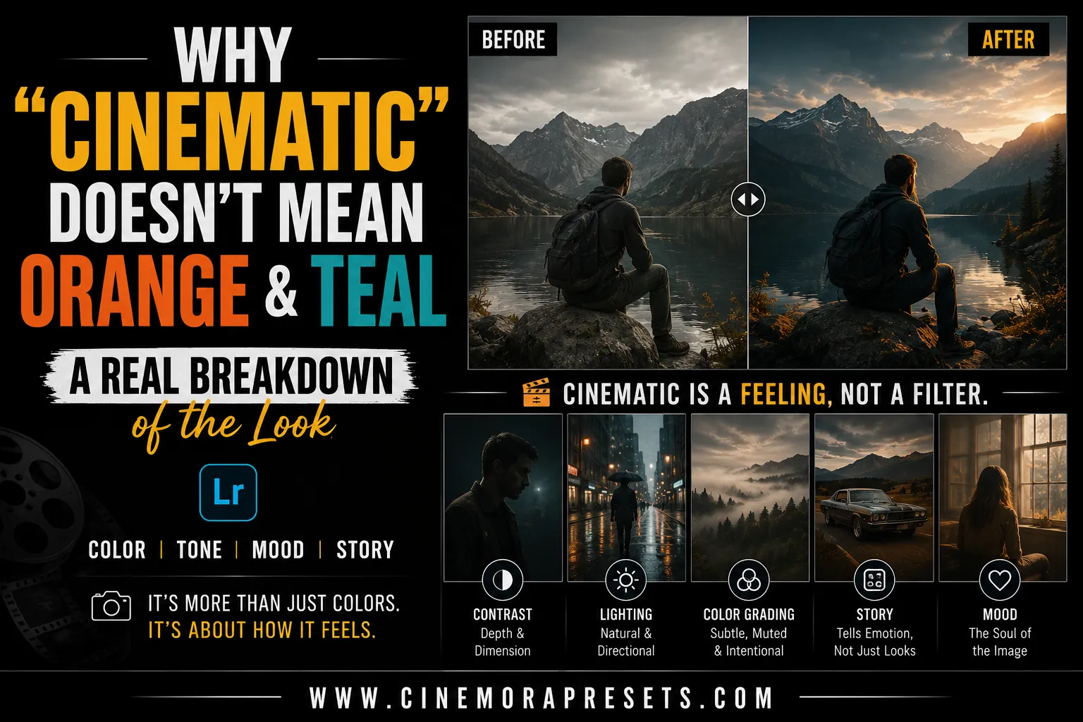
TL;DR: The cinematic look is not just a color preset. While the orange and teal color scheme has technical roots in protecting skin tones, a true cinematic photo relies on aspect ratio, lighting direction, contrast, and storytelling. Learn how to look past the social media formula to create real, atmospheric edits.
If you spend any time looking for photography tips online, you have likely come across the term "cinematic" repeatedly. Often, it is treated as a synonym for one specific color grade: bright orange highlights and dark teal shadows.
However, if you examine actual film history, this formula is just a small part of the whole picture. Reducing the movie look to only these two colors removes the essence of what makes cinematography so impactful. Let's explore where this look originated, why it is overused, and what truly makes a photo evoke the feel of a film still.
Where the Orange and Teal Look Actually Came From
The orange and teal look did not start as a trendy style. It arose from a practical need during the shift from physical film to digital color grading in programs like DaVinci Resolve.
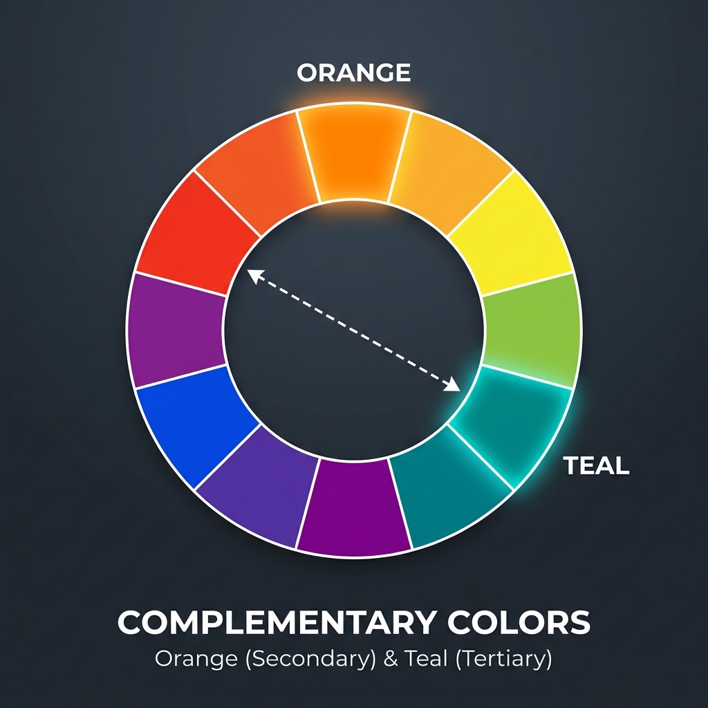
In color science, human skin tones—regardless of ethnicity—are found in a narrow, warm band of the color spectrum, centered around the orange range. To make actors stand out from their backgrounds, colorists used the principle of complementary colors. Blue and teal oppose orange on the color wheel, so pushing shadows and backgrounds toward teal maximizes visual contrast.
By cooling down the shadows while maintaining warm skin tones, filmmakers guide the viewer's attention to the actors. This workflow was designed to create depth and separate the subject from the background. It was not an arbitrary choice.
How It Became a Shortcut on Social Media
As digital cameras and editing apps became widely available, creators sought an easy way to mimic the high-budget feel of Hollywood films. Software companies and preset creators recognized that orange and teal was the most recognizable pattern in blockbuster movies.
Soon, the market was flooded with "one-click cinematic presets" that forced every image into this strict color formula. The problem is that presets cannot analyze the story or lighting of your photo. They just apply mathematical changes to your color wheels.
When you simplify a complex, scene-specific color grading decision into a generic filter, you lose the original intent. The look shifted from a storytelling tool to a visual stamp applied to every photo.
What Actually Makes a Photo Feel Cinematic
If cinematic does not mean orange and teal, what does it mean? A true film-like photo relies on visual elements that go beyond just adjusting color.
Aspect Ratio and Framing
Movies are shown on wide screens, not square boxes. Using wider aspect ratios—like 16:9 or 2.39:1—changes how we view a photo. It encourages you to compose using negative space, allowing the environment to contribute to the story. Adding clean black bars (letterboxing) or framing your subject off-center imitates how directors position their shots.
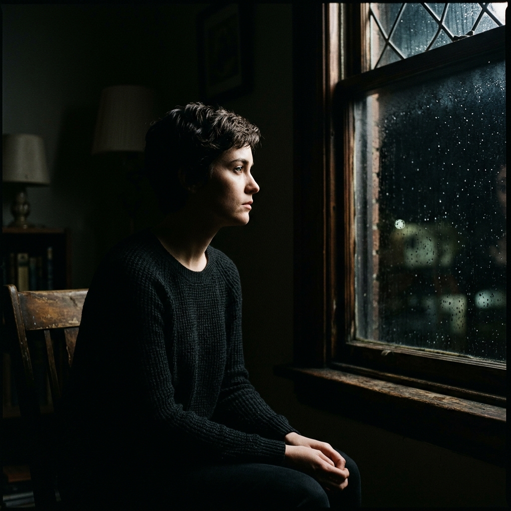
Lighting Direction and Contrast
Flat, front-lit photos rarely feel cinematic. Cinema involves working with light. Using side lighting (like window light), backlighting, or high-contrast shadows creates depth and mystery. The transition between light and shadow (the roll-off) gives film its organic, dimensional quality.
Motion Blur and Depth of Field
Cinematographers use depth of field to guide where the eye focuses. A shallow depth of field isolates the subject from a busy background. Similarly, a touch of motion blur can make a frame feel dynamic, capturing a fleeting moment instead of a static pose.
Color Palette as Mood, Not Formula
A movie’s color palette is chosen based on its emotional tone, not a set template. The green, sterile tones of The Matrix feel very different from the warm yellows of Mad Max: Road Fury, or the cold blues of Arrival. A cinematic photo can be warm, cold, muted, or even monochromatic. The colors should reflect the mood of the scene, not adhere to a preset formula.
When Orange and Teal Actually Works
We should not entirely dismiss the orange and teal look—it became popular for a reason. There are specific situations where it is the right creative choice:
- Night City Scenes: When warm streetlights or neon signs reflect off wet pavement, cooling down the dark ambient shadows to teal creates a striking, neon-noir effect.
- Natural Sunlight and Water: Portraits taken during golden hour against a blue ocean or sky fit the palette naturally. The environment supports the edit, making it feel organic rather than forced.
When It Doesn't Work (and Why You See It Everywhere Anyway)
You see orange and teal used frequently because it offers a quick shortcut to make an image appear “edited” on a small phone screen. However, it doesn't work in many cases:
- Overcast and Green Landscapes: Forcing a forest scene or a cloudy day into orange and teal diminishes the natural green tones, making grass appear lifeless and the sky look artificial.
- Flat Midday Light: Applying a heavy color grade to a photo without directional shadows can make the image look muddled and fake.
If a photo’s original lighting lacks natural warmth and cool shadow areas, imposing this look will always appear as a cheap filter.
How I Approach "Cinematic" in My Own Presets
When I create presets, I do not default to a copy-paste orange and teal approach. Instead, I focus on replicating the physical qualities of film.
I begin by building soft, faded highlight roll-offs and matte shadow curves to mimic analog film stocks. Then, I create color profiles that respect the natural environment. If a preset is for moody forest shots, it preserves the deep greens and earthy tones. If it’s for street photography, it balances contrast to allow urban light sources to shine naturally. The aim is to enhance the story your photo already tells, not to mask it.
Try It Yourself
Before you import your next photo and apply your favorite preset, take a moment to examine the raw image. Ask yourself: What is the natural mood of this lighting, and what story is this scene conveying? Once you understand the mood, you can choose an edit that elevates it.
If you want to experiment with different color themes, try our Cinemora Cinematic Preset Pack for a refined, film-like grade, or check out our dedicated Teal Orange Presets for those specific night and golden hour scenes where the classic contrast shines.
Frequently Asked Questions
What does cinematic actually mean in photography?
It means creating a photo that feels like a still frame from a movie. This is achieved through wide aspect ratios, dramatic lighting, shallow depth of field, and storytelling.
Why is orange and teal so popular in movies?
They sit opposite each other on the color wheel. Since skin tones are warm, cooling shadows to teal creates maximum color contrast, making subjects pop.
Does a cinematic photo have to be orange and teal?
No. Movies use a wide variety of color palettes to convey different moods, including cool blues, muted greens, warm desaturated tones, or monochromatic looks.
How can I make my photos look cinematic without presets?
Shoot in a wide aspect ratio (like 16:9), use dramatic side or backlighting, create a shallow depth of field, and grade colors to match the scene's actual mood.
Why do orange and teal presets sometimes look bad?
They look bad when forced onto photos that don't match the lighting. Applying them to flat, bright daylight shots creates muddy greens and unnatural skin tones.