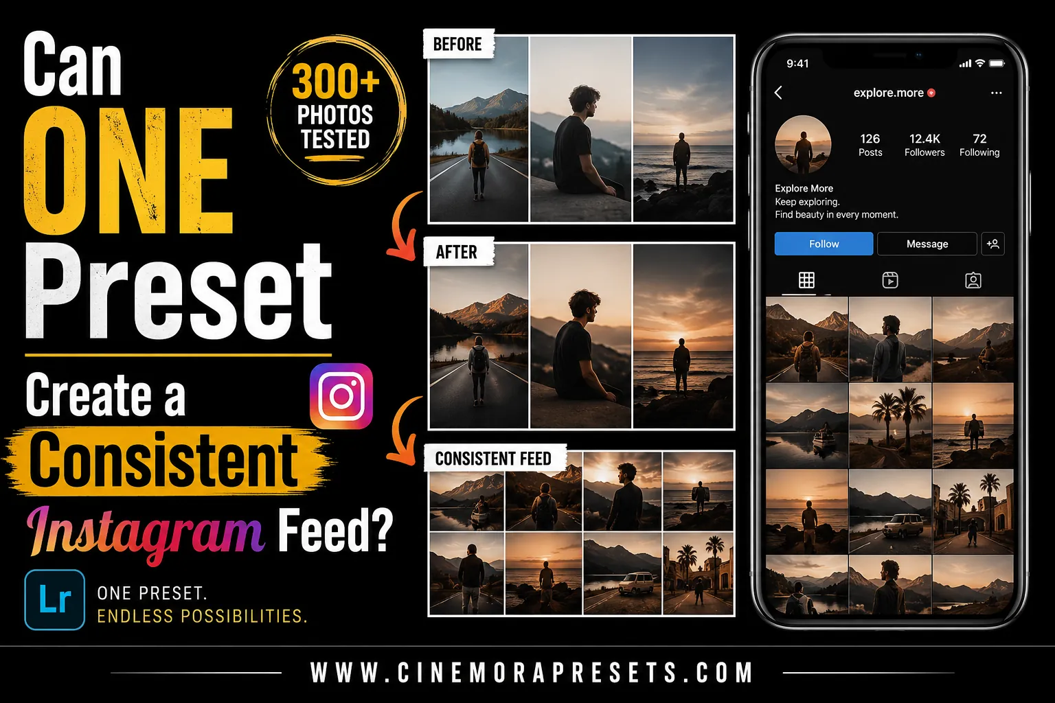
TL;DR: Yes, a single preset can create a consistent Instagram feed, but not in a single click. To build a cohesive grid, apply your chosen preset and then manually adjust the Exposure and White Balance of each photo to match the overall feed brightness and temperature.
If you have ever scrolled through a popular creator's Instagram feed, you've probably noticed how every single photo seems to match perfectly. Whether it's a bright and airy travel grid or a moody, dark-toned street aesthetic, the visual cohesion is undeniable.
This leads to a common question: Can you achieve this level of consistency using just one Lightroom preset?
The short answer is yes, but it requires a bit of manual effort. Here is the honest truth about how presets work, why one-click edits fail, and the exact steps to build a unified feed.
Why One-Click Presets Do Not Exist
Many beginners buy a preset, apply it to their photos, and feel frustrated when the images look completely different. One photo looks beautifully polished, while the next looks faded or has incorrect skin tones.
This happens because a preset applies a fixed set of adjustments to your photo's exposure, contrast, and color channels. Since every photo starts with a unique combination of light, camera sensor data, and environment, the starting points are completely different.
For example, look at what happens when applying the exact same Beige Lightroom Preset to two different photos below:
In the first photo, the warm light conditions make the skin look a bit too yellowish. In the second photo, the preset works beautifully without effort, giving that clean, desired beige vibe.
To make a single preset work across your entire feed, you need to understand how to adjust it for each image.
The 3-Step Strategy for a Consistent Feed
1. Choose a Versatile Base Preset
Don't choose a preset simply because you like one preview image. Instead, choose a preset family that matches the lighting you shoot in most often. If you shoot outdoors on cloudy days, a film style works beautifully. If you shoot clean indoor fashion, look for neutral beige or minimal presets.
2. Master the "Two-Slider" Tweak
Once you apply your preset, do not touch the advanced color panels right away. Instead, immediately adjust these two sliders in the Basic panel:
- Exposure: Make sure your photos have a similar level of overall brightness.
- Temperature (White Balance): Adjust the warmth or coolness so your whites and skin tones match the rest of your grid. If your photo looks like the yellowish example above, cooling down the temperature slider will immediately clean up the edit.
3. Coordinate Your Shoots
Presets edit the colors already present in your photos—they cannot generate new ones. If your preset shifts greens to olive-browns, but you shoot in a neon-lit arcade, the photo will look out of place. Try to shoot in similar locations, use consistent outfits, or focus on a matching color palette.
Quick Reference: Common Preset Issues & Fixes
Use this quick table to troubleshoot your photos after applying your preset:
| Issue | Cause | Easy Fix |
|---|---|---|
| Skin looks too orange | High ambient warmth | Slide Temperature toward blue, or lower Orange Saturation |
| Photo is too dark | Underexposure | Increase the Exposure slider (+0.20 to +0.80) |
| Highlights are blown out | Harsh sunlight | Pull the Highlights slider down (-30 to -60) |
| Colors look muddy | Flat flat lighting | Boost Contrast (+10 to +20) or lift Shadows slightly |
Final Thoughts
A consistent Instagram aesthetic is not about applying a preset and calling it a day. It is about establishing a unifying color base and making tiny adjustments to keep the light consistent.
By committing to a single preset family and spending five seconds tweaking the exposure and temperature on each photo, you will build a cohesive, professional feed that stands out.
Frequently Asked Questions
Can one preset work for every photo on Instagram?
No. A single preset cannot work perfectly on every photo because lighting, white balance, and colors vary. However, it serves as a consistent baseline that you can easily tweak in seconds.
Should I edit JPEG or RAW photos for a consistent feed?
You should edit RAW files. RAW images retain all uncompressed color and light data, making it much easier to adjust white balance and exposure to match your feed's theme.
How do I choose the right preset for my feed?
Pick a preset style (like pastel, moody, or film) that matches your primary shooting environment and the light you naturally shoot in most often.