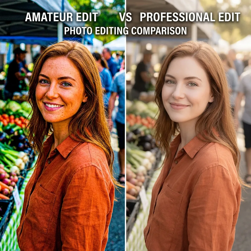
TL;DR: The five Lightroom mistakes that make photos look cheap are using too much saturation, crushing shadow details, over-sharpening, ignoring white balance, and expecting presets to be a one-click solution. Professional edits focus on clean colors, balanced shadows, and natural skin tones.
A few years ago, I thought making photos look professional was simple: more contrast, more saturation, and more sharpening. If a photo looked dramatic, I assumed it looked better. Looking back, many of those edits looked cheap. The colors were unrealistic, the skin tones were too orange, the shadows were crushed, and everything looked heavily processed.
The funny thing is that most photographers make the same mistakes when they first start using Lightroom. The good news is that these mistakes are easy to fix.
Quick Summary Table
| Mistake | Why It Looks Cheap | Quick Fix |
|---|---|---|
| Too much saturation | Fake colors | Reduce Saturation or use Vibrance |
| Crushed shadows | Lost detail | Raise Shadows slightly |
| Over-sharpening | Harsh texture | Sharpen conservatively |
| Poor white balance | Strange colors | Adjust Temperature and Tint |
| One-click preset use | Inconsistent results | Fine-tune exposure and colors |
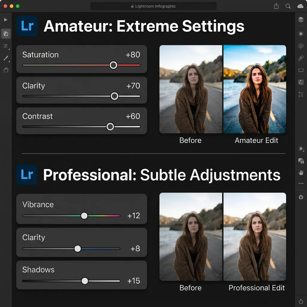
Mistake #1: Using Too Much Saturation
This is probably the fastest way to make a photo look amateur. Bright colors attract attention, so many people increase saturation until every color jumps off the screen. The result is grass that turns neon green, skies that become electric blue, and skin tones that become orange. The photo simply no longer looks real.
Why Professionals Avoid Excessive Saturation
Professional photographers usually aim for believable colors. The goal is not to make viewers notice the editing; the goal is to make viewers notice the photo itself.
How to Fix It
Instead of increasing Saturation, try using Vibrance. Vibrance protects skin tones better and creates a more natural result. You can also open the HSL panel and reduce individual colors rather than boosting everything at once.
Mistake #2: Crushing the Shadows
Many photographers want a moody look. Unfortunately, they often drag the Shadows and Blacks sliders too far. This removes essential detail from dark areas and creates muddy, flat-looking shadows.
Signs You're Crushing Shadows
- Black clothing loses all of its texture and detail.
- Hair becomes one dark, solid shape.
- Background details completely disappear in dark areas.
- Shadows contain no visible pixel information.
How to Fix It
After applying a preset, try to increase the Shadows slider slightly or raise the Blacks if necessary. Zoom in and check the darker areas of the image; a small amount of visible detail almost always looks better than pure black shadows.
Mistake #3: Over-Sharpening Everything
Sharpening is useful, but too much sharpening is not. Many beginners increase the sharpening slider because the image initially appears more detailed, but the problem is that excessive sharpening creates harsh digital edges and unnatural textures.
Common Symptoms
- Rough-looking skin texture and exaggerated pores.
- Visible digital noise and grain artifacts.
- Bright halo outlines around objects and horizons.
- Artificial, crunchy textures.
How to Fix It
Always evaluate your sharpening adjustments at 100% zoom. Portrait photos generally need significantly less sharpening than landscapes. If skin starts looking rough or crunchy, you've probably gone too far.
Mistake #4: Ignoring White Balance
If white shirts look yellow or skin looks slightly green, white balance is usually the first thing I fix. Many photographers spend hours adjusting individual colors while completely ignoring the setting that controls how all colors are rendered in the first place.
Why White Balance Matters
White balance directly affects skin tones, clothing colors, background environments, and the overall mood of the photo. Even a great preset can look terrible if the white balance is set incorrectly for the lighting conditions of that specific shot.
How to Fix It
Before making advanced color adjustments, check the Temperature and Tint sliders. Aim for natural-looking, healthy skin tones. This single step often improves a photo more than any preset.
Mistake #5: Expecting Presets to Do Everything
This is one of the biggest Lightroom myths. A preset is not a finished edit; it is simply a starting point. The same preset can look amazing on one image and terrible on another because every photo is different.
Different photos have:
- Different lighting conditions
- Different exposure levels
- Different initial white balance settings
- Different camera sensors and lens profiles
- Different color environments
You can check your photo's camera model, lens, exposure, and white balance using our Image Metadata Viewer before making adjustments.
That is completely normal.
How to Fix It
Whenever you apply a preset, always take a few seconds to adjust the Exposure, correct the White Balance, fine-tune the Highlights and Shadows, and adjust individual colors if needed. If you've ever wondered why presets sometimes look different than the preview image, this is usually the reason. For a deeper explanation, read our guide on Why Lightroom Presets Look Different on Every Photo.
What Professional Lightroom Edits Usually Have in Common
Many photographers assume professional edits require complicated techniques. In reality, most great edits share a few simple characteristics: natural skin tones, balanced contrast, controlled highlights, realistic colors, and a consistent white balance. They rarely rely on extreme settings, as subtle edits tend to look much more expensive and timeless.
My Lightroom Workflow
Whenever I edit a photo in Lightroom Mobile or Lightroom Desktop, I follow the same process:
- Fix exposure.
- Correct white balance.
- Apply a preset.
- Recover highlights if necessary.
- Open shadows slightly.
- Fine-tune skin tones.
- Export.
This takes less than two minutes and prevents most editing mistakes.
Final Thoughts
Most cheap-looking edits happen because photographers try to do too much: more saturation, more contrast, more sharpening, and more effects. Professional-looking photos usually come from restraint.
If you focus on natural colors, balanced contrast, accurate skin tones, and thoughtful adjustments after applying presets, your edits will instantly look cleaner and more professional. The goal is not to make viewers notice the editing; the goal is to make them notice the photo.
Frequently Asked Questions
Why do Lightroom photos sometimes look fake?
Photos often look fake because of excessive saturation, sharpening, contrast, or incorrect white balance. Small adjustments usually create more realistic results.
Is Vibrance better than Saturation?
In most cases, yes. Vibrance increases muted colors while protecting skin tones, making it easier to achieve natural-looking edits.
Why do my presets look different on every photo?
Presets apply the same settings to different photos. Because every image has unique lighting, exposure, and color conditions, results will vary.
Should I edit RAW or JPEG photos?
RAW files provide significantly more editing flexibility. JPEG files can still be edited, but they offer less dynamic range and color information.